Why we dislike Citybus’s latest rebrand
As it prepared the absorption of New World First Bus (NWFB) on 1st July 2023, Citybus introduced a redesigned logo. The new logo follows the principles of flat design, the dominant trend embraced by many around the world which calls for a crisp and modern feeling and rejects unnecessary details like drop shadow and gradient. Yet the rebrand has been met with criticism and disdain by many. What has gone wrong in Citybus’s rebrand?
A good corporate logo should reflect the brand’s value proposition and crystallise its identity, and the new Citybus logo has done a bad job in achieving that. Citybus claims in the press kit that “[the] brand spirit of speed and a forward-thinking mentality” is maintained in the new logo, yet I think you’ll agree with me that it is hardly the case. In fact, it is the radiating lines and the wordmark (the brand name specially treated for use in a logo) in the previous logo that embodies these elements of Citybus’s brand spirit. The removal of these elements from the logo without any substitute means that the logo fails to represent the company properly, and could not say anything about its value proposition.

The new logo could be said to comprise two parts — the icon and the wordmark, The stylised “Big C”, which incorporates a left-pointing arrow, has been a long-standing icon found in successive generations of Citybus’s logo, and it is wise for the company to retain it and make it a principal standalone element in the latest logo. The narrowing of the arrow-shaped opening means that the visual weight of “Big C” has increased, yet at the same time, the visual weight of the wordmark drops due to the adoption of a thinner font. This has created a mismatch between logo’s two parts.

It is believed that the wordmark in the new logo is adapted from the Helvetica font. (For the uninitiated: Arial, the default typeface used in Microsoft systems before, is highly similar to Helvetica) While the use of Helvetica in brand logos is not uncommon, few would use such a thin variation in creating logos.


As Citybus starts to cover up the NWFB logos on the latter’s fleet, a serious problem arises: the wordmark in thin blue font does not create enough contrast with the orange background. It leads us to doubt if the new logo’s designer (if any) has given the company any style guide or brand guidelines to ensure the proper use of Citybus’s new logo.
Lousy Chinese wordmark
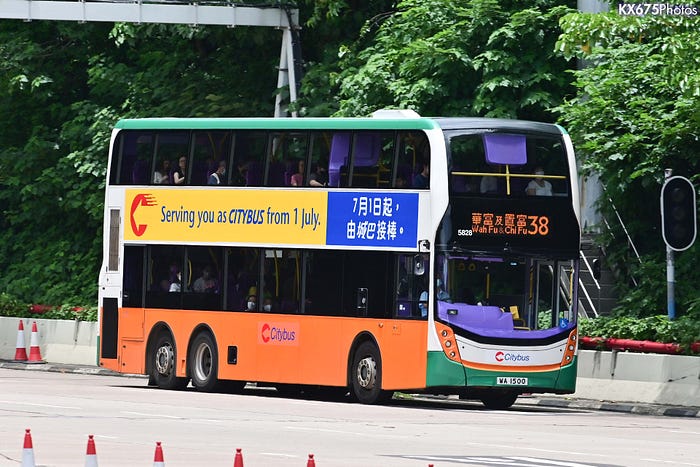
One month before the franchise merger, Citybus unveiled its new brand identity at a launch ceremony held. At that time, the new Citybus logo’s wordmark was in English only, and did not include a Chinese legend.

It was announced in the launch ceremony that the company would begin covering NWFB logos on the fleet up with the new Citybus logo, pending repaint of each vehicle at a later date. The “sample” F/N 5828 unveiled at the ceremony did not carry the Chinese legend in the logo stickers:
Later, Bravo Transport began to paste the new Citybus logo on the rest of the NWFB fleet. This version of the Citybus logo contains the Chinese characters “城巴”, which are styled similarly to the English ones, featuring rounded corners and slanted angles. However, there is a noticeable difference in the slant angle between the Chinese characters and the English characters, as well as the vertical lines within the “Big C” logo (with angles of 80°, 77°, and 71° respectively).

The bilingual version of the Citybus new logo has both vertical (Chinese on top, English below) and horizontal (left Chinese, center English, right Chinese) versions. Upon careful observation of the horizontal version, it can be noted that the top baseline (green line in the lower diagram) and the bottom baseline (purple line) of the Chinese “城巴” align directly with the top baseline (green) and bottom baseline (orange) of the English “Citybus.” Due to certain letters in the English part (e.g., the descender of the ‘y’ in the Citybus new logo — red) having descenders (parts that extend downward) , something that does not exist in Chinese characters, the horizontal alignment of Chinese and English characters would not be directly based on the bottom baseline of the English characters (i.e., the bottom of the descender) in general. This is to avoid, as seen in the new Citybus logo, the English characters appearing as if they are suspended upwards (above the blue space) due to the descender. A more common practice is to align the middle line of the English characters, excluding the descender part, with the middle line of the Chinese characters (i.e., aligning the two yellow lines).

It certainly seems to me that the designer planned to dispense with the Chinese legend, yet for some reason the client (Citybus) decided to add it back and either did it in-house or send it back to the designer who did it arbitrarily.
New typefaces on promotional items
Apart from the changes in the logo, Citybus has also made a significant alteration in the typefaces used in its promotional materials, such as posters and passenger notices. The original Chinese font was LiHei Pro, and the English font was Stone Sans Semibold. Both have been replaced with Noto Sans / Source Han and Roboto, providing a unified visual identity.

Both Noto Sans / Source Han and Roboto are open-source fonts developed by Google, available for free commercial use and easily downloadable from Google. In contrast, LiHei Pro and Stone Sans are commercially licensed fonts.
The design process of Noto Sans / Source Han drew inspiration from Roboto, and they happen to be the default Chinese and English fonts on the Android system. This compatibility enhances the visual appeal of their combination. Both fonts offer various weights (Bold, Medium, Regular, Light, etc.), providing flexibility for different scenarios such as titles and body text, which is a departure from Citybus’s previous practice of using only one font weight for Chinese and English text.

Currently, Citybus has extended the use of Noto Sans / Source Han and Roboto beyond promotional posters to include passenger notices, internal notices, and press releases. This shift diverges from the previous practice of predominantly using default Ming and Arial fonts that come with the computer OS. It is believed that internal guidelines have been provided to instruct employees to use fonts that align with the company’s latest visual identity when drafting documents. The dedication of Citybus to achieving font consistency internally is indeed a positive development. However, opinions may vary on whether Noto Sans / Source Han and Roboto align with Citybus’s image.
“If it ain’t broke, don’t fix it”
The saying “If it ain’t broke, don’t fix it” is widely used to discourage people from changing something that is working well, for doing so might lead to adverse effects. In the field of brand image design, this statement is highly controversial. However, the recent brand revamp by Citybus seems to validate this assertion.
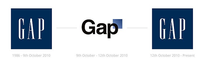
Fashion brand Gap had been using its logo with blue squares and narrow white font for many years. In 2010, they suddenly announced a rebranding effort, hoping to modernize the brand image and revive declining sales since the financial crisis. The new logo adopted the Helvetica font, although it was bolder than the weight used by Citybus. The new logo faced intense backlash from consumers and the design community, criticizing it for being inconsistent with Gap’s established image and poorly designed. After only six days of use, Gap decided to retire the new logo and return to the old one. Millions of dollars spent on the rebranding effort went to waste, and the president responsible for the rebranding resigned.
I pointed out some design issues with the new logo of Citybus above, such as alignment, oblique angles, etc, that might seem very technical in nature. Some may say I am too obsessed with graphic design and the whole article is purely technical rants. Whether the new logo is well or poorly designed, it indeed does not pose any significant impact on the commuting experience. However, the fatal flaw of the new logo is its inability to highlight Citybus’s own positioning and corporate personality. It is also characteristic of the carelessness and haste under the new management style of the company. Of course, considering how Citybus reacts to its criticisms, I won’t expect any improvement in the visible future. But after all, it is a brand that the author grew up with and has worked for. One does not hope for this company to go downhill.

An online source reveals that Citybus is considering to change the logo of Cityflyer, its award winning airport coach service, to make it in line with the new corporate branding. While Citybus has not officially announced Cityflyer’s rebranding, they have submitted a trademark registration application to the Intellectual Property Department.
This seems to be another illustration of “If it ain’t broke, don’t fix it.” The original logo’s curved lines matched the arch-shaped top of the airport terminal, but what elements representing the airport does the new logo have? The original color scheme featured an elegant maroon paired with the iconic Citybus yellow, while the use of shocking pink on the new logo for the vehicle body raises questions about its suitability.
Let’s hope Citybus doesn’t make the same mistake again.
(This article was expanded and updated from a post published on the KXEnviro Facebook page on 25 June 2023, a few days before the merger of franchises.)
